Overview
Movie posters are designed to grab attention, spark interest, and give the audience a look into the story they are about to experience. A well-designed movie poster does more than just showcase a film; it communicates mood, theme, and sets the emotional tone. Gestalt principles, a set of ideas from psychology about how people perceive and organize visual information, play a vital role in the impact of well-designed movie posters. As Miles Kimball notes in his piece Design Principles: An Empirical Study of Design Lore, “So at best, design principles are a kind of lore. Lore is a kind of contingent knowledge based in practice, and as North has argued for composition studies, it has a value that is often overlooked.” This highlights how Gestalt principles function as adaptable guidelines rooted in practical application rather than rigid rules.
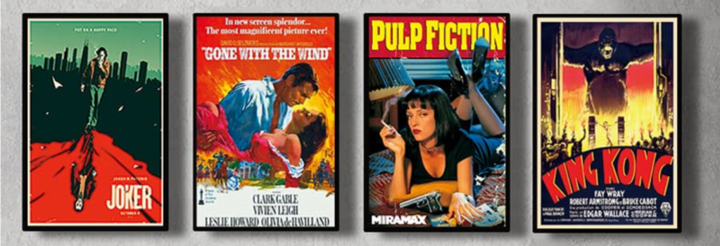
Gestalt principles such as figure-ground, proximity, closure, similarity, continuity, and common fate bring iconic movie posters—particularly Inception, Avengers: Endgame, Jaws, Black Panther, Star Wars: The Force Awakens, and Mad Max: Fury Road—to life. By understanding how Gestalt principles are applied, viewers can greatly appreciate the artistry behind movie posters and how they influence audiences.
The effectiveness of a well-designed poster is not only about visual appeal; it’s also about creating an emotional connection with the audience. Research from Statista shows that positive reviews from critics on a movie poster can significantly influence a potential moviegoer’s decision. The data reveals that the presence of these positive reviews had the highest influence, with 39 percent of people stating that seeing a critic’s praise would make them more likely to go see a movie. This statistic highlights how elements, such as reviews, can enhance a movie poster’s ability to drive viewers to the theater, making design principles like Gestalt even more impactful in attracting audiences.
Gestalt Principles Explained
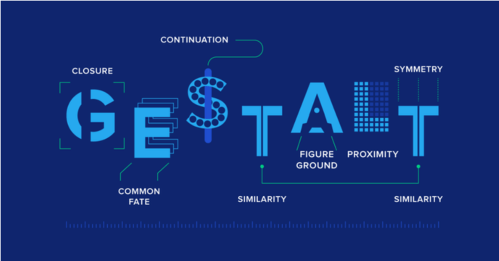
According to Carolann Bonner’s article Using Gestalt Principles for Natural Interactions, “Gestalt is a term used in psychology which expresses the idea that the whole of something is more important to our understanding than the individual parts. The Gestalt principles describe the way our mind interprets visual elements”. These principles explain how humans naturally organize visual elements into patterns and groups, including proximity, similarity, closure, figure-ground, and continuity.
For example, when elements are close together (proximity), people tend to see them as a group. When elements look alike (similarity), they are perceived as connected. Closure refers to the mind’s ability to fill in gaps in an incomplete shape to perceive it as a whole. Figure-ground highlights how people distinguish objects (figure) from their background (ground), while continuity refers to the tendency to follow lines and curves to perceive a unified whole.
As Laura Busche explains in Simplicity, Symmetry and More: Gestalt Theory and the Design Principles it Gave Birth To, “The main idea was that when we perceive the world many different signals are coming in at the same time. To organize them, and avoid going crazy, we visualize our surroundings as unitary forms or groups.” Similarly, Trifonas and Pericles expand on this in their piece The Semeiotics of Visual Perception and the Autonomy of Pictorial Text: Toward a Semeiotic Pedagogy of the Image, noting that “According to the Gestalt Theory of perception, the perceiving organism obtains visual data from the environment by scanning the visual field. Gestalten, or organized forms, are generated as holistic perceptual structures of invariant shapes, or figures, that tend to contrast against the larger background of a visual field.” Together, these insights emphasize that Gestalt principles are not just abstract ideas but practical tools that reflect how humans instinctively process visual information, enabling them to create meaning from complexity.
As mentioned in Julia Moszkowicz’s piece Gestalt and Graphic Design: An Exploration of the Humanistic and Therapeutic Effects of Visual Organization, “Gestalt psychology has been a foundation for visual communication, influencing design disciplines across Europe and America. It gained importance as a significant form-giving methodology, particularly at the New Bauhaus in Chicago, where György Kepes worked as a tutor in 1937, emphasizing how these principles could guide the viewer’s perception,” (Moszkowicz, 2011). In movie posters, these principles do just that—directing the viewer’s eyes, emphasizing key elements, and creating balance. By organizing visual elements according to Gestalt principles, designers ensure that a poster communicates its story effectively and draws the audience in.
Exploring Movie Posters
inception
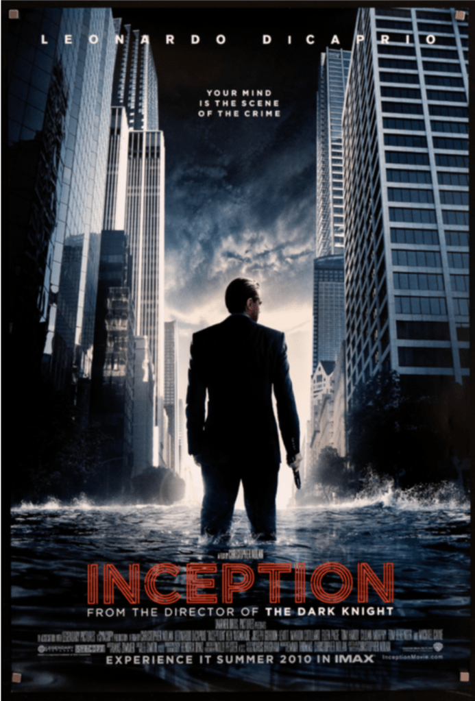
The poster for Inception uses the figure-ground principle. The main character, played by Leonardo DiCaprio, is positioned against a disorienting cityscape that is folding upon itself and the viewer’s eyes instantly lock onto him. This creates significant visual contrast which highlights the protagonist of the film as the focal point, while making the movie’s surreal and dreamlike themes obvious. The layering of elements draws the viewers’ eye, establishing a hierarchy that mirrors the complicated aspects of the film. Figure-ground is not just about contrast but also about storytelling. The city’s warped look hints at the challenges and dangers in the dream world, inviting viewers to imagine what is bound to happen. This principle works because it gives the audience’s brain a focal point. Without it, the poster would feel cluttered and confusing. Designers use figure-ground to direct attention where they want it. It’s why viewers focus on the hero, not the noise around them.
avengers: endgame

Proximity plays a significant role in movie posters by creating relationships between elements. Designers often place the title near the main character or central image to draw attention to the film’s name. For instance, in the poster for Avengers: Endgame, the arrangement of characters nearby creates a sense of unity and teamwork which reinforces the solidarity in their final fight.
Additionally, this poster is packed with characters yet it does not feel overwhelming, with figures like Iron Man and Captain America being placed prominently. The characters are grouped into smaller clusters. The audience’s mind interprets these groups as teams or alliances, which mirrors the story of the Avengers themselves. Proximity simplifies complicated visuals, helping the brain to organize the information. Without it, the poster would just be overwhelmed with different characters and places to look.
In addition to proximity, the psychology of colors is used in this poster. According to Ceille Clark-Keane in their article 8 Ways to Use Color Psychology in Marketing (With Examples), “Color can play a big role in marketing-whether you’re paying attention to it or not. The colors that you use in your branding, including your logo, and other marketing collateral evoke an emotional response in your audience, whether they realize it or not.” The Avengers: Endgame movie poster’s main colors are purple and red. Purple represents introspection, justice, and mystery. Red represents power, passion, and action.
Jaws
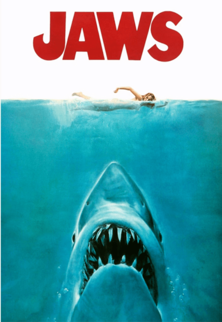
The poster for Jaws is a textbook example of closure. Beneath the silhouette of a swimming person, a shark’s head emerging from the water is incomplete, yet the mind imagines the rest of the shark and the danger it represents, especially with the swimmer floating above it. Closure works well in horror movie posters because it engages the audience’s imagination, making the threat feel more personal and immediate. The negative space around the shark and swimmer adds to the tension, amplifying the film’s sense of impending doom. Closure is a subtle yet powerful way to make visuals more memorable.
Additionally, this poster uses the concept of bottom-up processing. According to Saul McLeod in his article Visual Perception Theory in Psychology, “Bottom up-processing is also known as data-driven processing because perception begins with the stimulus itself. Processing is carried out in one direction from the retinol to the visual cortex, with each successive stage in the visual pathway carrying out an ever more complex analysis of the input.” (McLeod, 2023). The first thing you are drawn to on this poster is the giant shark head, and your eyes rise upward towards the silhouette of the swimmer.
Black Panther

The Black Panther poster relies on similarity to create visual cohesion. The repetitive use of Wakandan motifs, metallic textures, and the color palette of black, blue, and silver ties the design together to create a unified look. These elements reflect the film’s cultural themes and futuristic setting. The similarity principle ensures that all elements feel connected. This principle helps your brain group similar elements together, making the design feel intentional and cohesive. Similarity is more than just making things look nice, it’s about creating a sense of belonging. When viewers see the Black Panther poster invites the audience into a rich, vibrant world.
Star Wars: the force awakens
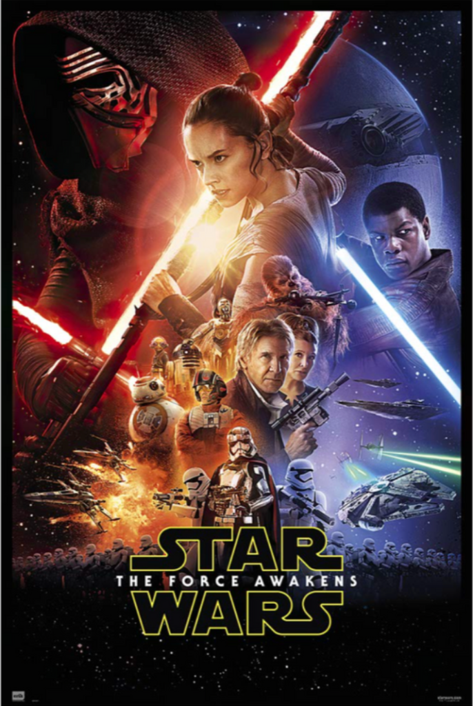
The Star Wars: The Force Awakens poster uses continuity to guide the viewer’s eye across its composition. The lightsabers, blasters, and diagonal lines create pathways that lead from one character to another, emphasizing the connections between them and the overarching conflict. Continuity also helps balance the poster’s elements. The placement of Rey and Kylo Ren on opposite sides creates symmetry, while the flow of lines between them suggests the ongoing struggle between the Light and Dark sides of the force. This use of continuity makes the poster dynamic and engaging, as the audience’s eyes do not just land in one spot, but they move along the poster.
Mad max: fury road

In the poster for Mad Max: Fury Road, common fate is used to convey a sense of motion and chaos. This principle groups elements that seem to move or align in the same direction. The characters and vehicles are all angled in the same direction, creating a feeling of forward momentum that mirrors the film’s relentless action sequences. The dust cloud behind the vehicles reinforces this movement, pulling the viewer’s eye through the image. This design choice captures the high stakes and energy of the story, making the poster feel as intense as the movie itself.
Factoring in Outside Design Elements
Plutchik’s Wheel of Emotions
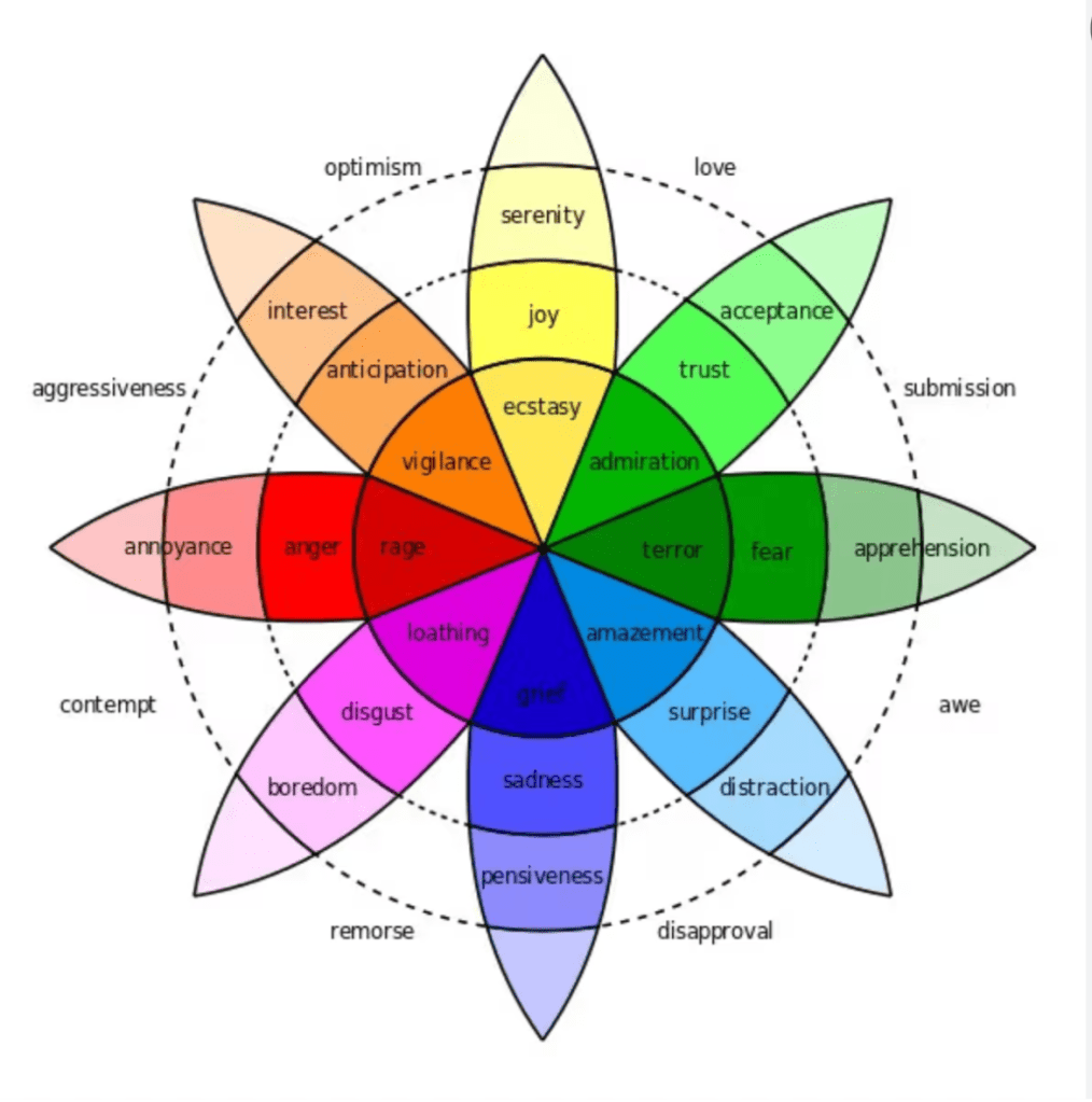
Incorporating Plutchik’s Wheel of Emotions into movie posters helps us understand the emotional impact these visuals aim to evoke. Plutchik’s Wheel, as Interactive Design Foundation describes in the article Putting Some Emotion into your Design – Plutchik’s Wheel for Emotions, emotions are organized in a circular, layered fashion, ranging from basic to more complex feelings. If we apply this to movie posters, we see how different emotions are triggered through visual design.
For example, the Inception poster, with its spinning top, evokes feelings of anticipation and fear, hinting at the uncertainty and mystery of dreams within dreams. The Avengers: Endgame poster, featuring the heroic faces of the characters, stirs joy and trust, signaling hope and finality in the epic battle. Jaws uses the image of a giant shark lurking beneath the water to generate fear and surprise, as the poster conveys imminent danger. Black Panther taps into pride and trust, symbolizing empowerment and cultural significance, especially through the representation of a strong, heroic leader. Star Wars: The Force Awakens uses iconic imagery like the lightsaber to evoke anticipation and fear, highlighting the return of conflict and the mystery of the Force. Finally, Mad Max: Fury Road uses chaotic, visuals to bring out anger and surprise, reflecting the intensity and relentless nature of the post-apocalyptic world.
These posters, by strategically tapping into basic emotions, help set the tone for the viewer’s experience of the films, whether they seek excitement, suspense, or empowerment. Gestalt principles and Plutchik’s Wheel of Emotions work together in movie posters by influencing how viewers perceive visual elements and the emotions they trigger. Gestalt’s focus on cohesion and patterns helps organize the emotional impact described in Plutchik’s theory, ensuring that the posters not only guide how we view the characters and scenes but also evoke the intended emotions like surprise, anger, and anticipation. Both theories, in this way, shape how the audience instinctively responds to the imagery.
Depth Cues
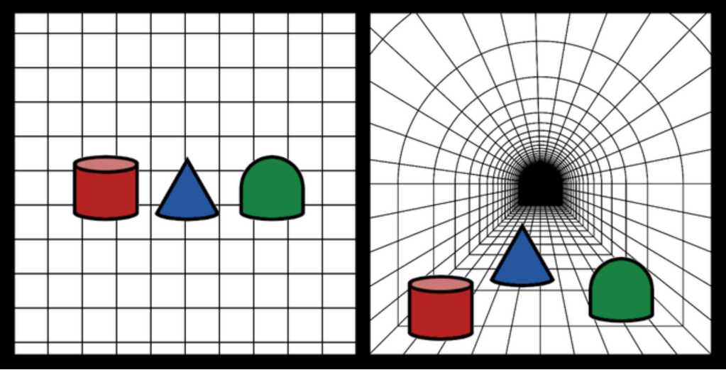
Additionally, depth cues, as described by Northern Michigan University in their article Depth Cues, are visual elements that create the illusion of three-dimensional space on a flat surface. These cues, such as size differences, overlap, and linear perspective make posters feel more immersive and dynamic.
Inception uses linear perspective, the lines of the cityscape in the background connect toward a vanishing point, creating a sense of depth and pulling the viewer’s eye toward the central figure. Avengers: Endgame uses overlap and arranges the characters by hierarchy and scale. This makes the main heroes stand out while supporting characters that are smaller in size. Jaws uses size difference, the shark appears disproportionately large compared to the swimmer above, creating a sense of lurking danger and emphasizing the predator’s dynamic. The Black Panther poster uses overlap as its characters emphasize their relationships with hierarchy within the story. The overlap creates a sense of depth and highlights the interconnected relationships between characters.
In Star Wars: The Force Awakens uses light and shadow to show the contrast between the brightly lit lightsabers on the darker background to give the illusion of depth. This helps to separate characters and objects within the poster. Mad Max: Fury Road uses texture gradient particularly for the rough texture of the desert in the foreground as it gradually becomes smoother and it recedes into the background, enhancing the setting. Gestalt’s principles tie into depth cues by helping organize and emphasize the visual information that creates a sense of space in the poster. Through the combination of depth cues and Gestalt principles, these posters not only establish a dimensional sense of space but also enhance the emotional impact on viewers.
Color Theory

Colors play a crucial role in shaping the emotional tone of a movie poster, as they influence how viewers perceive the film and set the stage for the experience. For example, warm colors like red and orange evoke excitement and urgency, while cool colors like blue and green suggest calmness, mystery, or sadness. As noted in the article Movie Posters: The Psychology Behind Its Designs from Indigo Music, color is a strategic tool used to trigger psychological responses and engage viewers emotionally. In the Inception poster, cool blue tones dominate, reflecting the film’s suspenseful and mysterious mood, and signaling a cerebral, mind-bending narrative.
In contrast, the Avengers: Endgame poster uses bold, intense colors like red and purple to convey a sense of urgency, power, and emotional intensity, mirroring the scale of the film’s action and stakes. Jaws employs deep blue and dark tones, which evoke fear and danger, particularly through the image of the shark lurking beneath the surface, enhancing the film’s suspense and terror. The Black Panther poster features blue and silver, bold colors that symbolize power, popularity, and pride, aligning with the movie’s themes of strength and leadership, while also conveying a sense of joy and anticipation. Star Wars: The Force Awakens uses a combination of bright yellow and red, conveying excitement, hope, and adventure, key emotions tied to the film’s storyline of resistance and discovery.
Finally, Mad Max: Fury Road utilizes fiery orange and red tones, which create a sense of anger, fear, and excitement, reflecting the film’s chaotic, high-energy action in a post-apocalyptic world. Each poster uses color not only to catch the viewer’s eye but also to enhance the psychological experience.
How the Experience Economy Impacts Movie Posters

Movie posters are a part of the experience economy, where the goal is to create memorable and immersive experiences. They offer a glimpse into the world of the film, merging imagery, typography, and composition to tell a story. Visual storytelling principles enhance this impact by combining design elements to evoke curiosity and anticipation from audiences. According to Shuyuan Yang in their piece Analysis of Top Box Office Poster Marketing Scheme Based On Data Mining and Deep Learning in the Context of Film Marketing, “Currently, posters are one of the most dominant art forms, especially in the film and television industries.
Film posters play a crucial role in film development and advertising.” This is because movie posters are not just promotional tools—they are part of the experience itself, helping to shape the audience’s expectations and emotional connection to the film. In the broader context of the experience economy, as discussed by Pine and Gilmore in their article Welcome to the Experience Economy published by Harvard Business Review, businesses must create experiences that engage consumers on an emotional level. Movie posters do this by using visual cues to invite the viewer into a world filled with emotion, drama, or adventure, effectively setting the stage for the larger cinematic experience.
This immersive approach enhances the poster’s role not only as a marketing tool but also as an entry point into a fully realized, engaging experience. By using art, design, and storytelling, movie posters play an essential role in sparking audience interest.
Gestalt Principles and Their Effect on Movie Posters
Gestalt principles are the foundation of effective movie poster design. Adam Blakemore states in his article The Inside Story: How Great Film Posters Create Meaningful Narratives, “Although poster designs incorporating narrative elements are nothing new, as the film market continues to grow, film posters that tell stories and create satisfying emotional engagement are becoming an essential part of the audience’s journey.” By applying concepts like figure-ground, proximity, closure, similarity, continuity, and common fate, designers create visuals that resonate with audiences.
These principles not only guide perception but also tell stories that evoke emotion. As Mike Montalto mentions in their article The Four Principles of Visual Storytelling, “We all know the importance of a good story, but powerful imagery allows your narrative to transcend the screen or page. Visual storytelling roots itself in the hearts and minds of the audience.” Through examples like Inception, Avengers: Endgame, Jaws, Black Panther, Star Wars: The Force Awakens, and Mad Max: Fury Road, viewers see how Gestalt principles elevate movie posters from simple advertisements to works of art. As the film industry evolves, the creative use of these principles will draw audiences in.
References
Blakemore, A. (2023, January 3). The inside story: How great film posters create meaningful narratives. LinkedIn. https://www.linkedin.com/pulse/inside-story-how-great-film-posters-create-meaningful-adam-blakemore/
Busche, L. (n.d.). Simplicity, symmetry and more: Gestalt theory and the design principles it gave birth to. https://www.canva.com/learn/gestalt-theory/
Carolann Bonner September 15. (2019, March 23). Using gestalt principles for natural interactions. thoughtbot. https://thoughtbot.com/blog/gestalt-principles
Carollo, L. (2023, January 5). Effect of movie poster content on moviegoing in the U.S. 2019. Statista. https://www.statista.com/statistics/1006264/movie-poster-content-influence-us-on-moviegoing/
Clark- Keane, C. (n.d.). 8 ways to use color psychology in marketing (with examples) | wordstream. https://www.wordstream.com/blog/ws/2022/07/12/color-psychology-marketing
Harvard Business Review. (2024, December 13). Putting some emotion into your design – plutchik’s wheel of emotions. The Interaction Design Foundation. https://www.interaction-design.org/literature/article/putting-some-emotion-into-your-design-plutchik-s-wheel-of-emotions
II, B. J. P., & Gilmore, J. H. (2014, August 1). Welcome to the experience economy. Harvard Business Review. https://hbr.org/1998/07/welcome-to-the-experience-economy
IMDb.com. (n.d.). Ratings, reviews, and where to watch the best movies & TV shows. IMDb. https://www.imdb.com/
The Interctive Design Foundation. (2024, December 13). Putting some emotion into your design – plutchik’s wheel of emotions. The Interaction Design Foundation. https://www.interaction-design.org/literature/article/putting-some-emotion-into-your-design-plutchik-s-wheel-of-emotions
Kimball, M. A. (2013). Visual design principles: An empirical study of design lore. Journal of Technical Writing and Communication, 43(1), 3–41. https://doi.org/10.2190/tw.43.1.b
McLeod, S. (2023, June 16). Visual perception theory in psychology. Simply Psychology. https://www.simplypsychology.org/perception-theories.html
Montalto, M. (2024, January 25). The four principles of visual storytelling. amplifi. https://amplifinp.com/blog/4-principles-visual-storytelling/
Moszkowicz, J. (2011). Gestalt and graphic design: An exploration of the humanistic and therapeutic effects of visual organization. Design Issues, 27(4), 56–67. https://doi.org/10.1162/desi_a_00105
Northern Michigan University. (n.d.). Cues. Depth_cues [art & design foundations]. http://artnet.nmu.edu/foundations/doku.php?id=depth_cues
Simplicity, symmetry and more: Gestalt theory and the design principles it gave birth to. (n.d.). https://www.canva.com/learn/gestalt-theory/
Trifonas, P. P. (2020). The semiotics of visual perception and the autonomy of pictorial text: Toward a semiotic pedagogy of the image. Educational Philosophy and Theory, 53(7), 696–705. https://doi.org/10.1080/00131857.2020.1761329
Y, S. (2024, August 7). Movie posters: The psychology behind its designs. HOME. https://indigomusic.com/feature/movie-posters-the-psychology-behind-its-designs
Yang, S. (2023). Analysis of top box office film poster marketing scheme based on data mining and deep learning in the context of film marketing. PLOS ONE, 18(1). https://doi.org/10.1371/journal.pone.0280848

Leave a comment