When it comes to understanding how an organization’s website is performing, content analysis is a crucial tool. I used two tools, Screaming Frog and Wave, to analyze the Ocean Conservancy website. Let me walk you through how these tools helped me evaluate its online presence.
Why Focus on Ocean Conservancy’s Website?
I chose to analyze Ocean Conservancy because I have always had a passion for saving marine life and I even donate to a few organizations. Ocean Conservancy is a non-profit dedicated to ocean conservation, and its website is central to its mission.
Analyzing its website content helps to understand how effectively Ocean Conservancy communicates its goals and engages with its audience. By doing this, we can identify strengths, weaknesses, and opportunities for improvement, which will help its mission to protect the ocean.
Screaming Frog

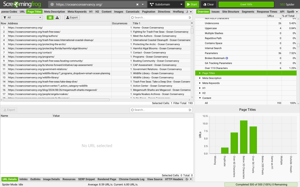
I used Screaming Frog to assess the Search Engine Optimization (SEO) of the Ocean Conservancy site. Think of Screaming Frog as a little robot vacuum and instead of crawling around your floors at home, it crawls around a website, digging into every corner to suck everything up.
This tool helped me identify pages with missing or duplicate meta descriptions and pinpoint broken links that could hurt user experience. By spotting these issues, Ocean Conservancy has the opportunity to optimize its site’s performance and make it easier for people to find and engage with its content.
Wave

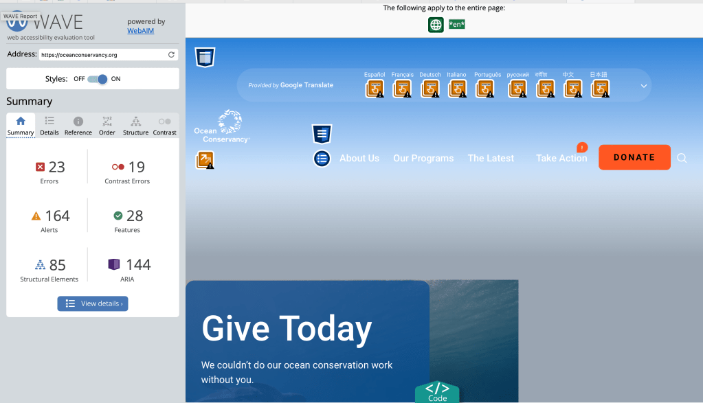
Wave ensures that a website is usable by everyone, regardless of their device or ability. Wave’s job is to spotlight any accessibility issues that might make it challenging for users to navigate or interact with the site.
For Ocean Conservancy, Wave identified some areas for improvement. It flagged missing alternative text for images, which is crucial for users who rely on screen readers. It also pointed out contrast issues in certain areas that could make it difficult for users with vision impairments to read the content comfortably. Wave’s insights are like a guide to making sure everyone can easily access and enjoy the website’s content.
Bringing It All Together
By using both Screaming Frog and Wave, I was able to get a comprehensive view of Ocean Conservancy’s website. The good news is that the site already shines in several areas: it has engaging visuals that effectively communicate the importance of ocean conservation, a user-friendly design that’s easy to navigate, and it’s mobile-friendly.
However, there’s always room for improvement. Screaming Frog and Wave revealed that some images lacked appropriate alt text, which can be a barrier for users who rely on screen readers. Additionally, there were contrast issues in certain parts of the site that could be challenging for readers with visual impairments. Duplicate headings were linked to different URLs, which could confuse users and impact SEO.
Addressing these findings will enhance the website’s usability, improve its search engine rankings, and ensure that more people can access and engage with Ocean Conservancy’s message.
This isn’t just about making technical tweaks to a website—it’s about aligning with Ocean Conservancy’s mission to protect our oceans by making sure its online presence is as effective and inclusive as possible.
Using Screaming Frog and Wave provided insights that can help Ocean Conservancy make its website faster, easier to use, and more accessible to everyone. If you’re working in the world of SEO or digital strategies, I recommend testing out these tools!
Find my full report on this content analysis below:

Leave a comment